The Full Story
Indoor makeover
When we took over the house, it had been home to a French family for over 40 years – and it showed. The walls were full of colour: a pink bedroom, a yellow kitchen, an orange living room and a bright green utility room. The classic French style of living is warm and colourful, but also heavier than the Nordic style we like.
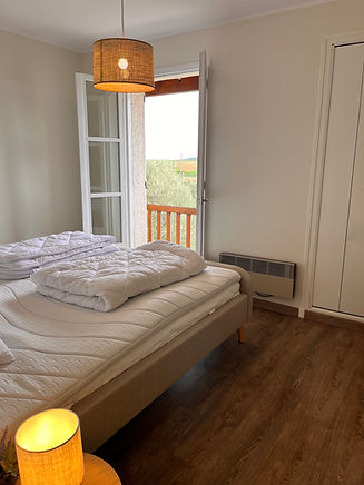
We wanted to preserve the soul of the house, but at the same time give it a more timeless and Scandinavian look. This meant lighter colors, simpler lines and a decor that creates calm and air. Here you can read about the changes we made indoors – from wall colors to furniture – to bring the house up-to-date without losing its charm.

Kitchen
we choose a sustainable solution
When we took over the house, we had an original, solid quality French cabinetry kitchen. Although the colors weren’t our style, we were impressed by the craftsmanship and the way the kitchen fit into the house. Instead of replacing the whole thing – a solution that would be both expensive and less environmentally friendly – we chose to preserve it and give it a new lease of life.
We gave the kitchen a makeover with:
-
Paint in light, Nordic shades that create calm and light
-
New lamps that give a modern touch and better lighting
-
Updated furniture that matches the Scandinavian style
The result? A kitchen that still has its French soul, but now with a timeless, Scandinavian expression – and a solution that is both beautiful and sustainable.
The work took 4 days and cost approximately 5000 kroner.


The dining room
from French orange to Nordic calm
The dining room was originally painted in a light orange tone, which gave the room a warm but also a bit heavy look. To create a more timeless and Scandinavian atmosphere, we chose to paint the walls in a creamy white, which gives light and calm to the room.
We added new furniture purchased from JYSK in France that fits perfectly with the style of the house, but at the same time gives a more modern touch. The result is a dining room that still harmonizes with the French charm of the house – now with a fresh and elegant Nordic twist.


The office
original wallpaper
I huset har vi et særligt værelse, som vi ønskede at forvandle til både kontor og opholdsrum. Rummet gemte på et unikt og smukt tapet, men dets charme blev skjult af lysserøde døre, karme, vinduer og skabe.
For at fremhæve tapetets særlige udtryk har vi malet de lysserøde elementer i mere neutrale toner. Nu står det originale tapet elegant frem og fortæller sin egen historie – et perfekt samspil mellem klassisk detaljerigdom og moderne funktionalitet.


The sofa room
bright and high ceilings
The living room was originally painted in the house's characteristic orange color, but we wanted a more calm and timeless look. Therefore, we have replaced the orange tone with a creamy white, which gives the room light and air. We have added new furniture, and now all that is missing is the pictures on the walls to complete the interior.
With a ceiling height of 8 meters, it required a lot of painting work at height – but the result is a room that feels both open and inviting.


The Swedish toilet
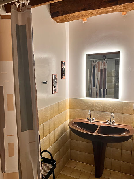
In France, it is quite common for the toilet and bathroom to be separate – and that was the case in our house as well. One particular toilet, however, made an unexpected impression. The room initially had a lovely retro charm with both the sink and toilet in a classic style, but the color combinations were… interesting.
Imagine pale yellow walls, a cobalt blue door, light brown tiles and a plain white toilet seat – a colorful encounter that didn't exactly tell a harmonious story.
With a little paint, new colors, and carefully selected accessories, it was transformed into a small, inviting space with personality and a calm expression. A good example of how even the smallest rooms can be significantly enhanced with just a few touches.


The many colors
If you have read the previous sections or seen the pictures, you have probably already discovered that the previous owners of our house were very fond of colors – in many variations. Yellow, orange, light green, pink, etc. The colors were everywhere and gave the house a quite distinctive expression.
For us, however, it became a bit too colorful. That's why we have chosen to tone down the color palette and create more calm and coherence in the rooms. This does not mean that colors have completely disappeared – but they have become fewer, more subdued and carefully selected. You can also see this in many of the pictures here on the blog.